LightWave 2023 review: 3D software makes strong return By Paul Hatton published 23 April 24 3D LightWave is back in the game thanks to a raft of new features, including an Unreal Engine bridge.
"Animation and art runs through us all": Inside the world of Bomper studio By 3D World staff published 14 April 24 magcontent Catching up with Emlyn Davies and Mark Procter of Wales-based animation studio Bomper on its 10th anniversary.
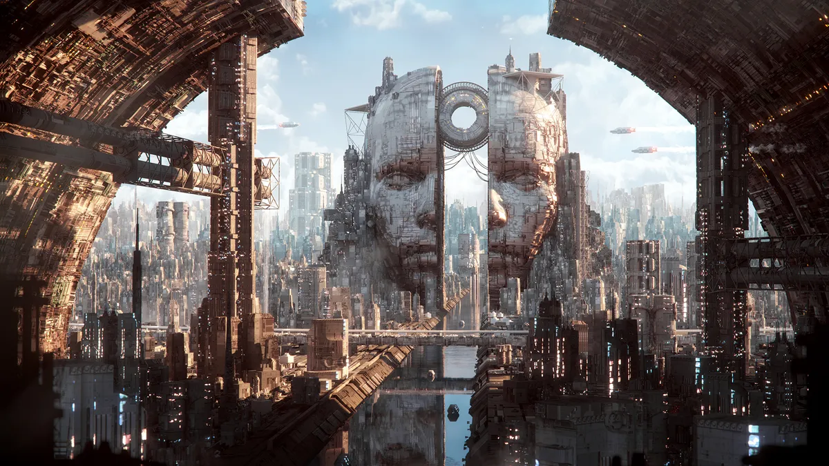
Inside the art of Annibale Siconolfi By Paul Hatton published 7 April 24 magcontent The Italian artist’s architectural background, the design philosophies behind his work, and why he’s a supporter of NFTs.
A day in the life: Senior animation supervisor Liz Bernard By 3D World staff published 6 April 24 magcontent Explore a not-so-average day in the life of the Digital Domain animation mastermind.
Creating a whole world with Jellyfish Pictures By James Clarke published 24 March 24 magcontent New creative director Archie Donato discusses the VFX and animation studio’s philosophy, leading a team, and the joy of creativity.
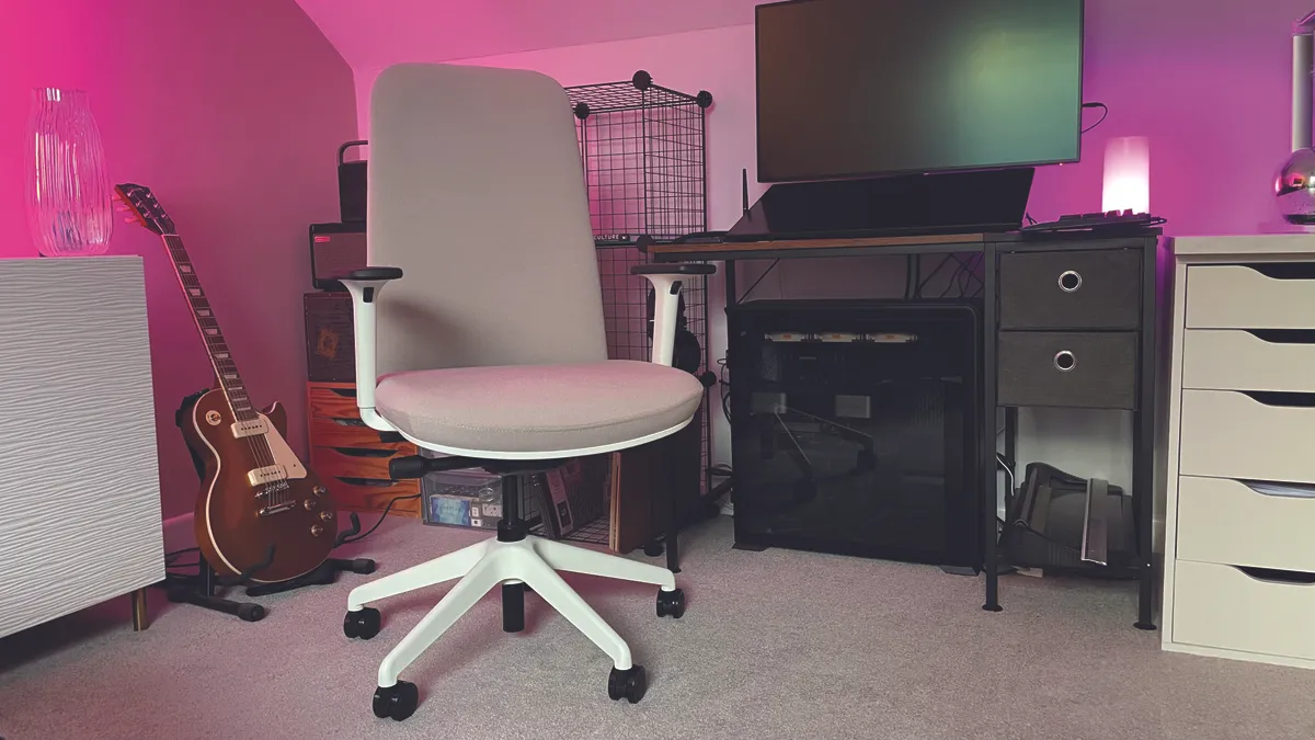
Boulies NUBI Series review: compact but comfortable and stylish chair By Cesci Angell published 24 March 24 office chairs It's snug, comfortable and highly adjustable - what's not to like about the Boulies NUBI Series?
Wacom One 13 Touch review: impressive features elevate entry-level pen display tablet By Cesci Angell published 22 March 24 Drawing Tablets Wacom ticks nearly every box for budding artists with the One 13 Touch.
How to render on the iPad using CLEO By Glen Southern published 17 March 24 magcontent A guide to both real-time and full ray-tracing from the convenience of your tablet.
The best laptops for 3D modelling By Erlingur Einarsson last updated 7 March 24 Hardware Find the best machines for 3D modelling and rendering.
Masking the Merc with a Mouth: How Deadpool's expression got animated By Beth Nicholls, Alice Pattillo published 28 February 24 Entertainment Wētā FX needed to translate Deadpool’s sense of humour through his disguise.
Framestore takes FLITE with Unreal By Trevor Hogg published 18 February 24 magcontent FLITE director Tim Webber discusses merging together two pipelines to make the ambitious short film.
The ultimate gift guide for digital creatives By Cesci Angell published 8 December 23 Buying Guide Must-have gifts for the digital creative in your life – from 3D printers to oil diffusers.
Free textures: where to get 3D textures for your artwork By Kerrie Hughes published 29 November 23 3D Download free textures for your 3D art.
The best 3D art: 37 incredible examples to inspire you By 3D World staff last updated 17 November 23 3D Visit another dimension with some of the best 3D art around.
How to create braided hair in Blender By Paul Hatton published 16 October 23 Digital Art A step-by-step guide to creating braided hair using Braidify.
How to create a stylised 3D portrait By Satoshi Arakawa published 7 October 23 3D Character artist Satoshi Arakawa demonstrates how he created a stylised portrait in real time using PBR materials.
Behind the art: interview with Pedro Conti By Paul Hatton published 30 September 23 Animation The animation specialist discusses his career path and favourite projects.
3ds Max 2024 review: a surprisingly fresh annual release By Paul Hatton published 25 September 23 Art Our expert's 3ds Max 2024 review reveals a new release that truly improves on this 3D software.
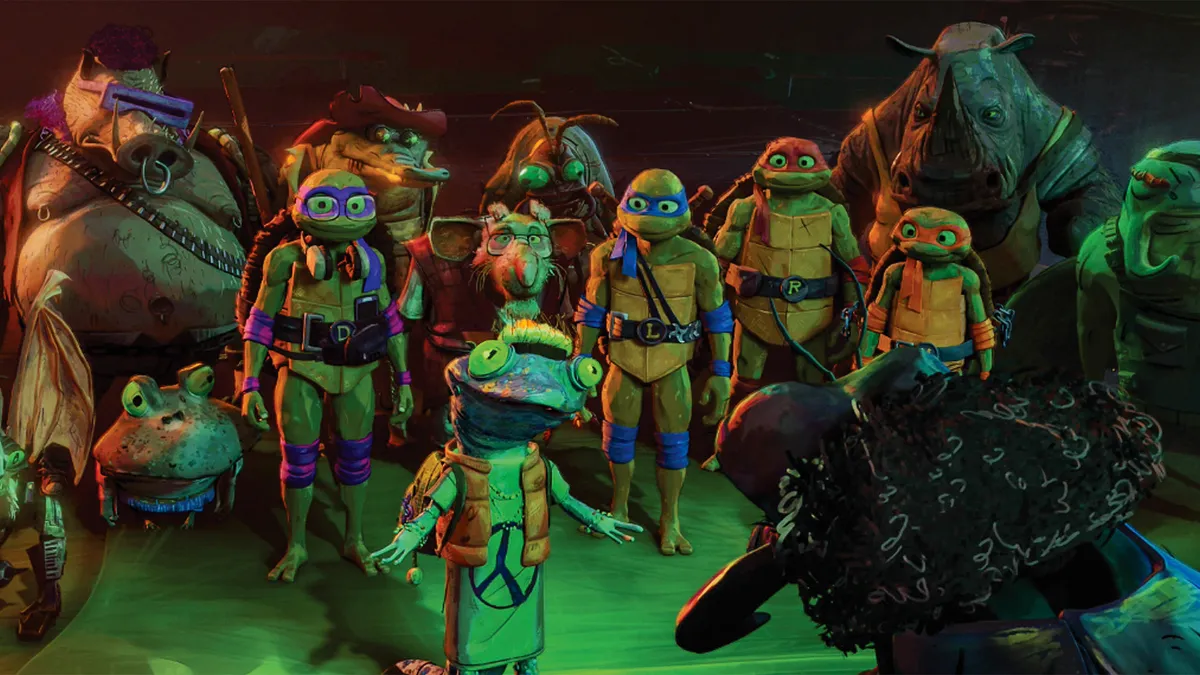
The VFX behind Teenage Mutant Ninja Turtles: Mutant Mayhem By James Clarke published 10 September 23 magcontent A behind-the-scenes peek at the new movie.
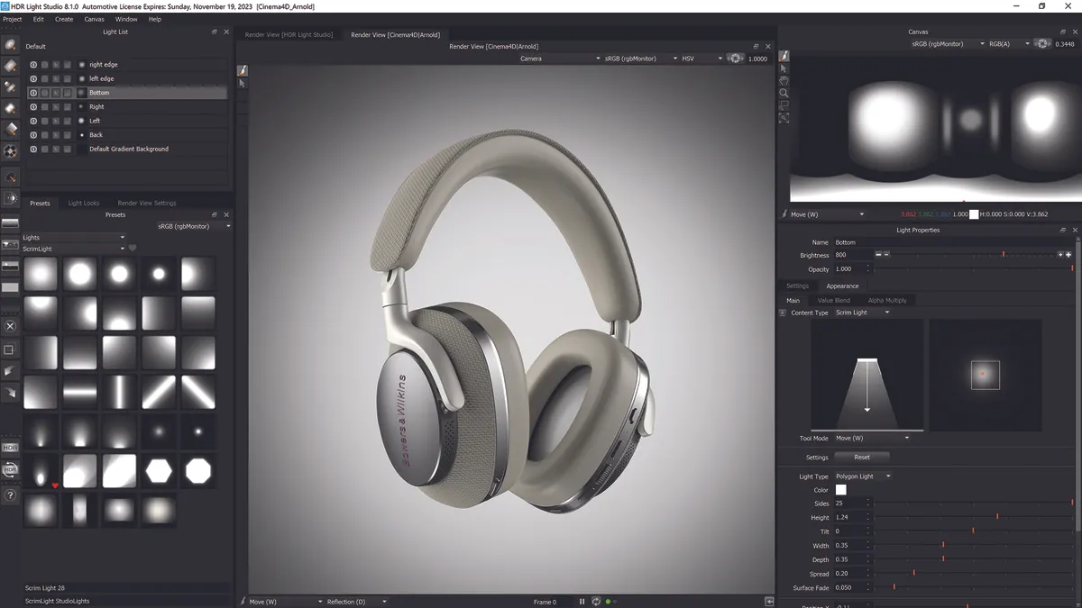
Lightmap HDR Light Studio review: great 3D lighting software gets even better By Rob Redman published 8 September 23 lightmap The newest edition of Lightmap HDR Light Studio has taken everything it does well and improved it further.